
Getting traffic to your landing pages is a great digital marketing strategy, but if that traffic doesn’t convert, it’s almost useless. Did you know that companies that take on a planned approach towards conversion optimisation are twice as likely to see a large increase in sales?
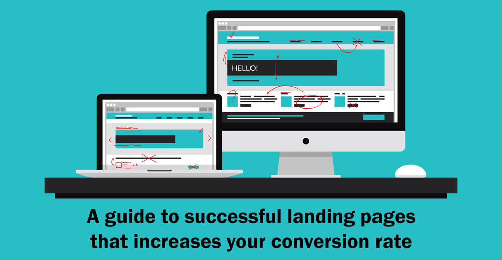
Here’s a guide to successful landing pages that increases your conversion rate if you integrate into your design, copywriting and strategic execution.
1. Visually-appealing design
First thing first, your landing page must look impressive if you want to attract conversions. A careless or unpleasing looking landing page isn’t going to inspire trust.
In addition, consider designing customised landing pages rather than using readily available templates. Consumers come across these templates all the time and they all begin to look the same. You need to differentiate yourself (especially your competitors) from all of the other offers out there.
If you are going to spend money to push traffic to your landing page then invest some of your budget into the design.
2. Clear & concise headline
The headline can make or break your website, and possibly a sale. A clear value proposition with meaningful and direct copy can drastically improve conversion rates.
One of the best ways to do this is by using powerful words or invoking emotions that will boom with your personas. Your headline is perhaps the single most important element of your landing page. Brainstorm at least 10 possibilities before choosing the strongest one.
3. Strong call to action
Your “buy now” or “order now” button may perform quite differently depending on where it’s placed, what colour it is and how big it is. An effective CTA (call to action) commands attention and encourages the visitor to complete the action, whether it is a purchase, placing a phone call or completing a form.
For instance, “Mozilla increased downloads of their popular Firefox browser by having a stronger call-to-action. “Download Now – Free” performed better than “Try Firefox 3”. They made it clear that Firefox was free and called the viewer to download the program.”
4. Make you unique selling proposition very clear:
Visitors should clearly see on your homepage or landing page why they should do business with you and the benefit of it.
A single clear offer makes the entire process much smoother. For example, if you are running a pay-per-click campaign, your ad copy, landing page copy and offer should all be appropriate. If a consumer clicks on your ad and then hits your landing page that has two offers it can cause a key glitch in the conversion process.
A great example of this is MailChimp:
There are plenty of email service providers out there, so for a company like MailChimp it’s quite difficult to differentiate themselves from their competitors. MailChimp made it different by focusing on making email campaigns easy.
5. Use graphics or video:
It’s important you keep your landing page simple and straightforward with little text along with the right image or video that can communicate an idea or elicit a certain response in your landing page’s visitor.
For best results, make sure your landing page has at least one pictorial display which:
- Flow simply with the page
- Communicate your content
- Appeal to the eye
- Stand out without contrasting too intensely
- Be evocative to encourage engagement
A simple video on landing pages assist to show there’s a real person behind your brand.
6. Goal Specific form:
Determine what information you need to generate maximum lead and ask for it. When asking for information in an email opt-in form, ask for as little information as necessary as it’s important to respect the users time. If you’ve gotten the user as far as wanting to sign up, it’s pivotal that you don’t let them drop off because your form is too lengthy.
Take a look at Dropbox’s signup form:
Dropbox is only asking for what they need. No username, no security questions, no birth date, no verification code, no re-enter password field, nothing unneeded. Just a short form with necessary information!
7. Badges of trust and credibility
Building trust is one of the most important responsibilities of an inbound marketer, and landing pages are a great medium to do so. Incorporating customer logos, customer testimonials or partner testimonials are all great ways to do this.
The average consumer is marketed to around the clock. Everywhere they look they see advertisements that claim to offer the best product or service. They are naturally cynical, so make sure to include information on your landing page that builds trust and displays credibility.
Include badges of trust, such as the Better Business Bureau or industry-specific accreditations. Reviews and media outlets that have covered your brand can also help to establish a level of trust and credibility.
8. Use thank you pages to your advantage
Finally, not using the redirect from your thank you page is a significant lost opportunity. The thank you page allows you to reintroduce the main header and footer navigation and give your prospect some key next steps, such as following through on the expectation and delivery of the promised content and having the opportunity to share your offer.
Useful Tips:
Below are a few highlight points to get you thinking before you design your landing page:
- A 1 second delay in your site speed can result in a 7% reduction in conversions.
- You have 0-8 seconds to make a compelling headline and landing page. After 8 seconds, the majority of visitors leave.
- The more landing pages you have, the more leads you are likely to get.
- Product videos can increase purchases of the product by 144%.
- A/B testing is becoming the preferred method that has brought a lot of the companies the most success.
- Approximately 96% of visitors that come to your website are not ready to buy.
Remember to optimise as best you can, and then keep testing to discover the best performing CTA’s, images, text, value propositions, and design formats. And, never stop optimising!
If you need any advice or support for designing your landing page, get in touch with us for FREE consultancy on 01772 508117.